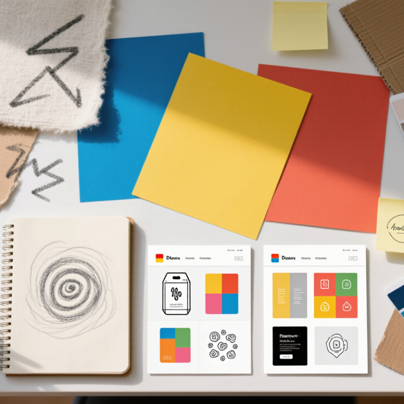
| Flexible visual systems | Modular layouts, adaptable marks, and reusable graphic elements. | Consistent presentation across packaging, websites, social media, and print. | Allow room for localized copy, different scripts, and varying text lengths. | Strong fit for projects requiring multiple formats or regional adaptations. |
| Expressive, readable typography | Distinctive type paired with clear hierarchy, adequate spacing, and legible body text. | Memorable character without sacrificing readability or usability. | Check glyph coverage, script support, licensing, and rendering at target sizes. | Useful when tested with the actual languages and devices in scope. |
| Accessible color and contrast | Color palettes supported by sufficient contrast and non-color cues. | Inclusive communication and clear information hierarchy. | Color meanings can differ by context; test contrast and interpretation with target users. | A practical baseline for digital work; WCAG 2.2 provides testable contrast criteria. |
| Localized illustration and imagery | Original artwork and context-aware imagery rather than generic visual shorthand. | Relevance, authenticity, and fewer cultural misunderstandings. | Review symbols, people, settings, and permissions with local stakeholders. | Best assessed through audience review, not assumptions based on geography alone. |
| Texture and tactile-inspired visuals | Grain, paper-like surfaces, handmade marks, and layered composition. | A distinctive, crafted feel that can stand apart from highly uniform layouts. | Confirm that details remain clear in small formats and reproduce well in the chosen medium. | Suitable when tactile character supports the message and production method. |
| Clear, information-led layouts | Visible hierarchy, concise labels, generous spacing, and scannable content blocks. | Fast comprehension across screens, print materials, and different levels of familiarity. | Plan for translation, right-to-left layouts where needed, and responsive formats. | A broadly useful approach; validate with real content and intended formats. |
| Responsible production cues | Design choices that make material, print, or digital-production details easy to understand. | Credible information about materials and production rather than unsupported environmental claims. | Substantiate claims for each market and avoid implying benefits the product or process cannot verify. | Use only documented claims; visual styling alone does not establish sustainability. |